
Depth
Relative lightness or darkness of a shade.
- Use: find the basic range
- Variable: pigment concentration and optics
- Tradeoff: Finish changes perceived depth
Shade matching matters because foundation, concealer, blush, lip, and brow color are judged relative to the skin and features around them. A match involves more than light or dark: undertone, saturation, opacity, finish, and placement determine whether an edge disappears or a color looks intentional.
Skin is not one uniform swatch. The face, jaw, neck, chest, discoloration, tanning, redness, and indoor versus daylight illumination can pull perception in different directions. Product color can also shift as it dries, mixes with oil, or becomes thicker. A useful match is the shade that performs its specific job after dry-down in the lighting and coverage level that will actually be worn.
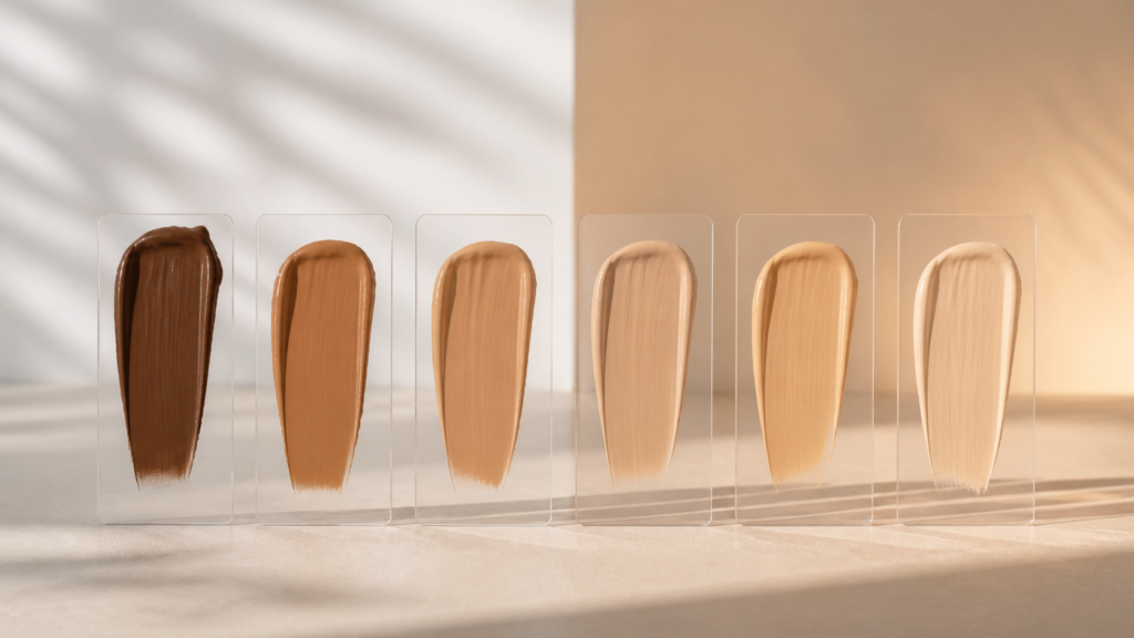
Explain shade matching as alignment of depth, undertone, saturation, opacity, and finish across the intended placement under relevant lighting, with dry-down, oxidation-like shifts, surrounding skin variation, mixing, returns, and inclusive range design affecting purchase success.
Tip: A match cannot be judged without a target.
These shade matching concepts separate mechanism, application, limits, and purchasing consequences.
Relative lightness or darkness of a shade.
Persistent warm, cool, neutral, olive, red, or other color direction beneath overall depth.
Intensity or mutedness of color.
Area chosen as the matching target, such as jaw-to-neck transition.
Color change between wet application and the set film.
Two colors appearing similar in one light but different in another.
Tip: Use these terms to test shade matching instead of relying on a front-label promise.
Foundation may bridge face and neck; concealer may match skin or intentionally brighten; blush should harmonize rather than disappear. Define the job before swatching.
A match cannot be judged without a target.
Place close candidates along the jaw when hygiene and policy permit. The best option should require the least explanation at the edge after spreading.
Comparison is more reliable than one isolated guess.
A depth match can still look peach, yellow, red, green, or gray relative to surrounding skin. Wait through set and compare the transition, not the shade name.
Brand undertone labels are starting clues, not universal coordinates.
Store lighting, warm home bulbs, office LEDs, flash, and phone processing alter perception. Metamerism means a close indoor match may separate outside.
A practical match survives the lights that matter.
Seasonal change or a limited shade range may require mixing, but two bottles raise cost and preservation concerns. Never mix products inside their original packages.
Shade-range gaps should not become unlimited consumer expense.
Shade matching can reduce visible edges and corrective layering; it cannot make one color identical across every body area, season, camera, and lighting source.
The shade meets the chosen reference area at the intended opacity.
Undertone and saturation remain coherent after dry-down and normal wear.
Names and online swatches are not standardized measurements.
A technically close match can still conflict with the desired effect or available range.
These claims flatten the variables that determine how shade matching performs in a real routine.
Vein color is affected by skin depth, lighting, anatomy, and perception. Direct facial swatches after dry-down are more relevant.
Hands often differ from face, neck, and chest through sun exposure and circulation. Use the area the product needs to visually bridge.
Labels such as warm, neutral, beige, sand, or caramel vary by brand and range. Compare actual dry swatches rather than translating names literally.
Evaporation, pigment wetting by oil, layer thickness, lighting, powder, and true chemical change can all alter appearance. Controlled time comparisons identify the pattern.
Sun exposure, redness, treatment, climate, and coverage needs can change visible color. Reassess rather than forcing thick correction with an outdated match.
Tip: Test the exact shade matching tool, setting, and routine before generalizing from its category.
The remaining decisions about shade matching concern technique, compatibility, safety, upkeep, and value.
Usually two to four close candidates reveal depth and undertone differences without covering the entire jaw. Use equal thin applications.
Follow the product behavior and allow the full visible set—often several minutes—before deciding. Recheck later if the formula is known to shift.
Choose the reference that creates the most coherent visible transition for clothing and coverage. The answer may vary when face, neck, and chest differ.
Yes when formulas are compatible, but mix only the needed dose on a clean palette. Record the ratio and do not combine products inside original packages.
Use calibrated brand tools cautiously, compare multiple real-light swatches, know a successful reference shade, check returns, and avoid relying on screen color alone.
Large depth jumps, repeated undertone gaps, or one saturated direction across deeper shades force mixing and compromise. Range architecture affects both inclusion and consumer cost.
Shade matching matters because depth, undertone, saturation, opacity, and finish determine whether a product meets its chosen reference zone after it sets. Skin variation and lighting make this an applied comparison, not a name lookup.
Swatch neighboring shades on the relevant area, wait for dry-down, check multiple lights, and use samples or returns strategically. The best match achieves the intended effect with the least corrective layering.
These Review Streets paths narrow the next shade matching decision by format, goal, and routine fit.
Browse face, eye, lip, brow, primer, and setting categories.
Compare liquid foundation coverage, finish, shade, and wear.
Choose a retailer
Prices checked regularly. We may earn a commission at no cost to you.